
Contents
Decision-Support Dashboard
All features of the Decision-Support Dashboard are built in Grafana. Interested in learning more about Grafana? Check out the docs.
Users with proper credentials can access the GLWA Eastside Decision-Support Dashboard by navigating and logging in to the Open-Storm Grafana Portal and click the GLWA Eastside Decision-Support Dashboard. Or follow the direct link here.
Having trouble logging in to our Grafana Dashboard? Check out Logging in to Open-Storm Grafana Page for more information.
Note
If you would like credentials to access the Decision-Support Dashboard, contact gregjewi@umich.edu.
Note
GLWA Operators using the Dashboard at SCC CLICK HERE .
Dashboard Architecture
Within Grafana, a connection is made to our application’s database within an InfluxDB instance. Having established this connection, we can build the dashboard visuals by specifying the particular measurements we want to query. During the run of the recommendation engine, graphics are built and uploaded to an AWS S3 bucket that reflect the latest recommendation. The image can then be accessed via its url in Grafana.
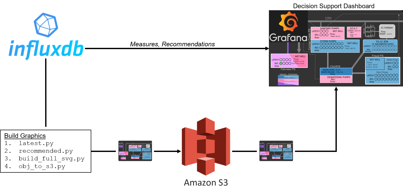
Decision-Support Dashboard architecture
Real-Time Graphic
The main feature of the Decision-Support Dashboard is the graphic displaying the latest sensor readings and the recommendations for the system.
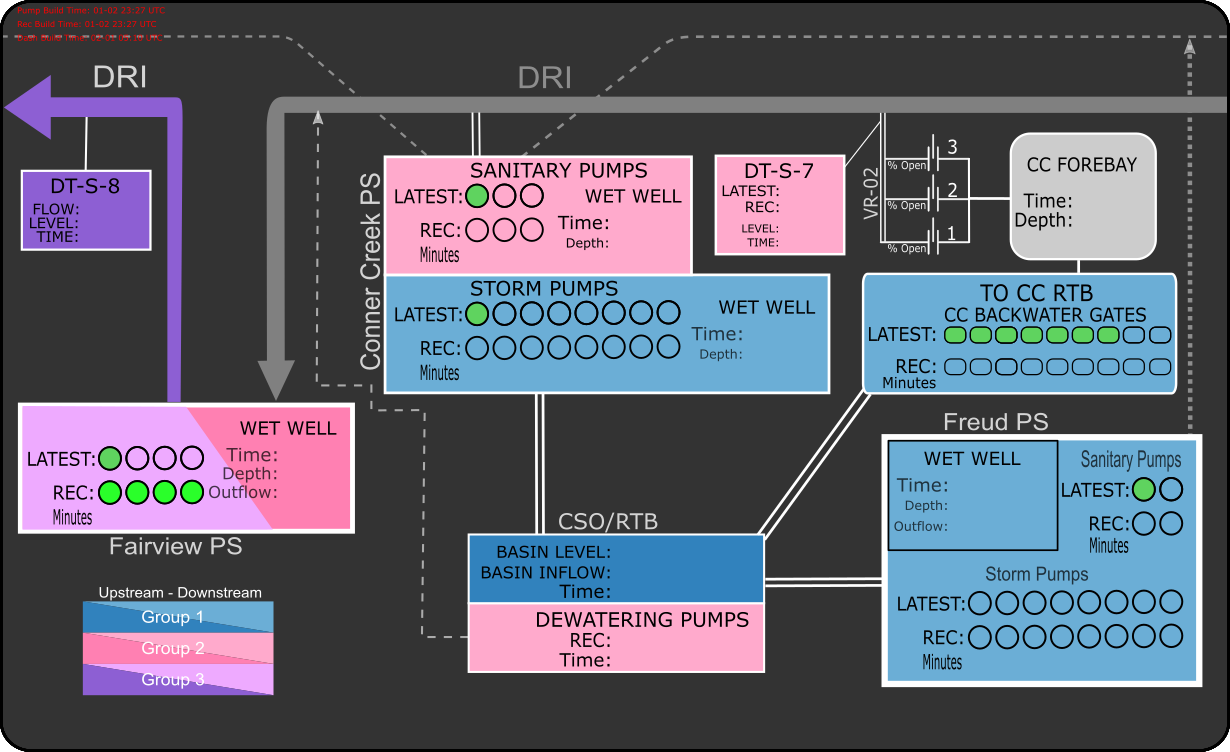
Primary graphic for Decision-Support Dashboard, GLWA eastside.
The Real-Time Graphic uses the Pictureit plugin available in Grafana [1]. This plugin allows measurements from our InlfuxDB Database to be superimposed on top of an image. The image displayed is upated every 10 minutes as part of the recommendation engine. More information on how the image is made can be found in Building SVG Dashboard Graphics.
| [1] | For future versions of the dashboard, another tool should be considered. Pictureit is no longer supported by its developer, making it incompatible with newer Grafana versions, and it does not support refreshing of the background image, requiring a workaround that dimishes the user experience. |
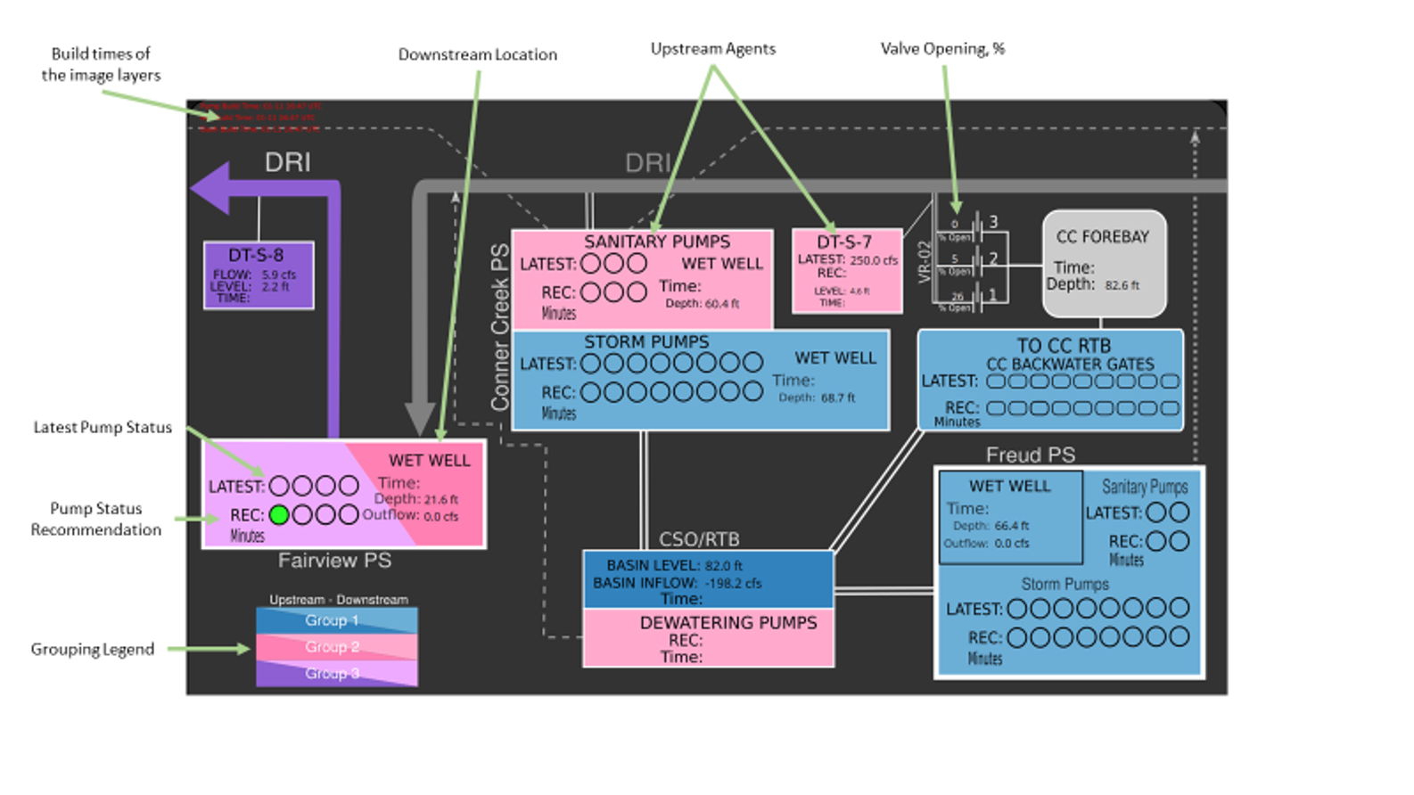
Interpretting The Real-Time Graphic
The Real-Time Graphic was designed to communicate control recommendations for the controllable assets within the network, while also providing the operator a visual reminder of the major infrastructure and their network typology. Colors of the assets describe the group or market that assets are associated with. As indicated in the grouping legend in the lower left corner of the graphic, lighter colors signify upstream agents whose actions affect the common downstream locations which are darker but same color.
The following are important feautures in the graphic:
REC: the most recent recommondation for the action that should be taken at a particular control location. Recommendations come in the form of a pump or gate On/Off status indicated by a green filling within the circles and rounded rectangles that represent pumps and gates respectively. Beneath a filled symbol indicating to turn ON a pump or OPEN a gate is also the amount of time in minutes that an operator should do so.
Latest: the most recent real measurements from the network for a particular control location. To be compared against recommendations.
Time: the time that the measurement or recommendation was taken. If the time is more than 10 minutes old, it may indicate that a sensor in the field is not reporting its measurements to the application or that the recommendation engine experiencing errors.
Timeseries Plots
Additionally, the Dashboard includes Timeseries Plots showing a variety of system measurements and recommendations. These plots allow operators to look at historical to real-time measurements and recommendations to visualize the system as a whole and control operation performance.
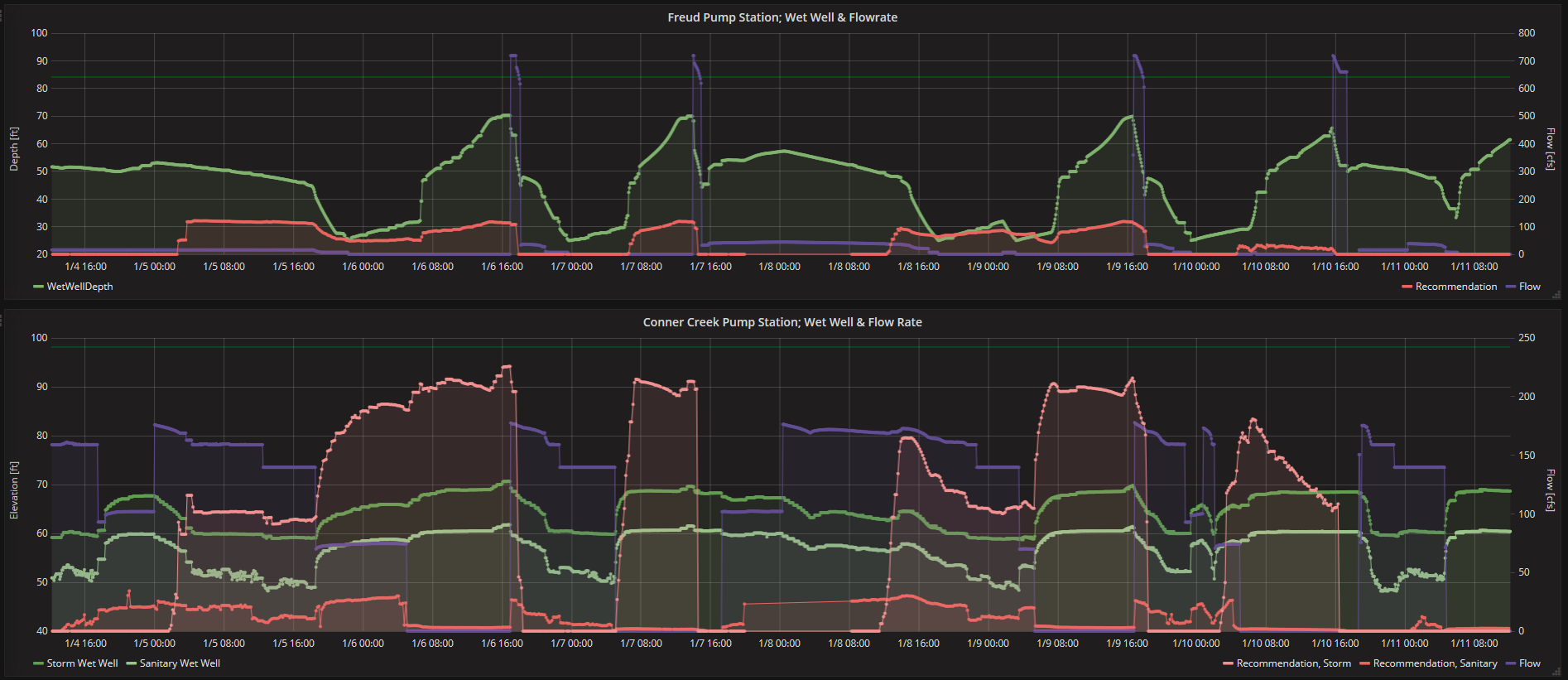
Timeseries plots showing up to real-time measurements and recommendations for system elements.
Plots of Pump and Gate Activity are also available.
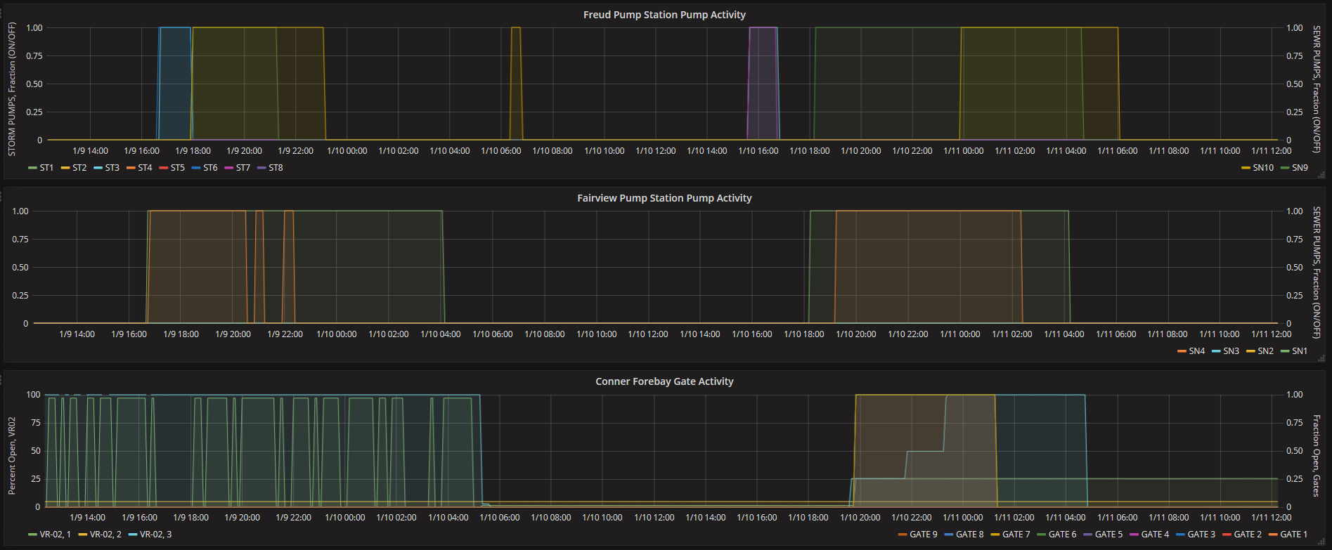
Timeseries plots showing the pump and gate activity (On/Off, Percent Open) at for system elements.